This case study outlines the redesign of a blockchain-powered fundraising platform aimed at helping SMEs raise capital and allowing investors to discover and fund high-potential businesses completely digitally. The redesign focused on improving brand awareness, onboarding, usability, and overall user experience to raise platform adoption and engagement.
The challenge
Despite a strong technological foundation and the growing relevance of blockchain in fundraising, the platform was struggling with:
- Low product/brand awareness among potential SME clients and investors.
- Low conversion rates on the marketing website.
- High user drop-off rates during onboarding and campaign creation.
- Usability issues throughout the core product such as campaign setup and investment flows.
- Limited active users (MAUs) despite sign-ups, indicating poor retention.
Objectives
Primary goals
- Increase monthly active users (MAUs) by 40% in 6 months.
- Improve conversion rate on the marketing site by 50%.
- Improve usability and task success rate on key user flows (onboarding, investment, campaign creation).
Secondary goals
- Clarify brand positioning and messaging to attract investors and founders.
- Reimagine and visual identity to appear more confident and trustworthy.
- Build trust in blockchain-backed transactions via better UX and communication.
Impact
After three months:
- MAUs increased by 81% , from approx. 2,100 to 3,800.
- Conversion rate increased by 75%, from 1,2% to 2,1%
- Onboarding completion rate saw an average increase of 89%, from 38% to 72%
- Bounce rate on marketing site decreased by 38%, from 68% to 42%
Target users
We needed to figure out who this was for in order to test with and design for the right user.
- Small and Medium Enterprises (start-up & scale-up) founders: Seeking non-traditional, fast capital raising methods.
- Investors: Looking for vetted investment opportunities in early-stage and growth businesses.
Blockpulse was itself in an incubator environment, making it easy to find the right participants for interviews and testing.
Research & Discovery
1. Stakeholder interviews
Uncovered business goals and friction points such as:
- Low confidence in user journey for both SMEs and investors.
- Unclear value proposition and inconsistent messaging on the marketing site.
2. User interviews & surveys
Insights from 20 users (10 founders, 10 investors) revealed:
- Confusion around blockchain and its benefits.
- Overwhelming jargon and poor onboarding.
- Lack of guidance in setting up fundraising campaigns or making first investments.
Prototyping & Testing
- Mid-fi prototypes tested with 10 returning and 10 new users.
- Conducted usability testing on:
- Campaign creation.
- Investor browsing/investment.
- Wallet setup and digital KYC.
- Used heatmaps and session recordings on new site design.
Results from Testing
The success rates of:
- Campaign creation flow improved by 95%.
- Investor investment flow improved by 84%.
- Wallet setup & KYC completion flow improved by 77%.
Design outcome
Brand and marketing site revamp
- New brand identity: Inspires trust, transparency, and growth.
- Homepage: focused value proposition, clear primary CTAs, and testimonials.
- Content: Educational articles on how blockchain enhances fundraising, legal instruments, etc.
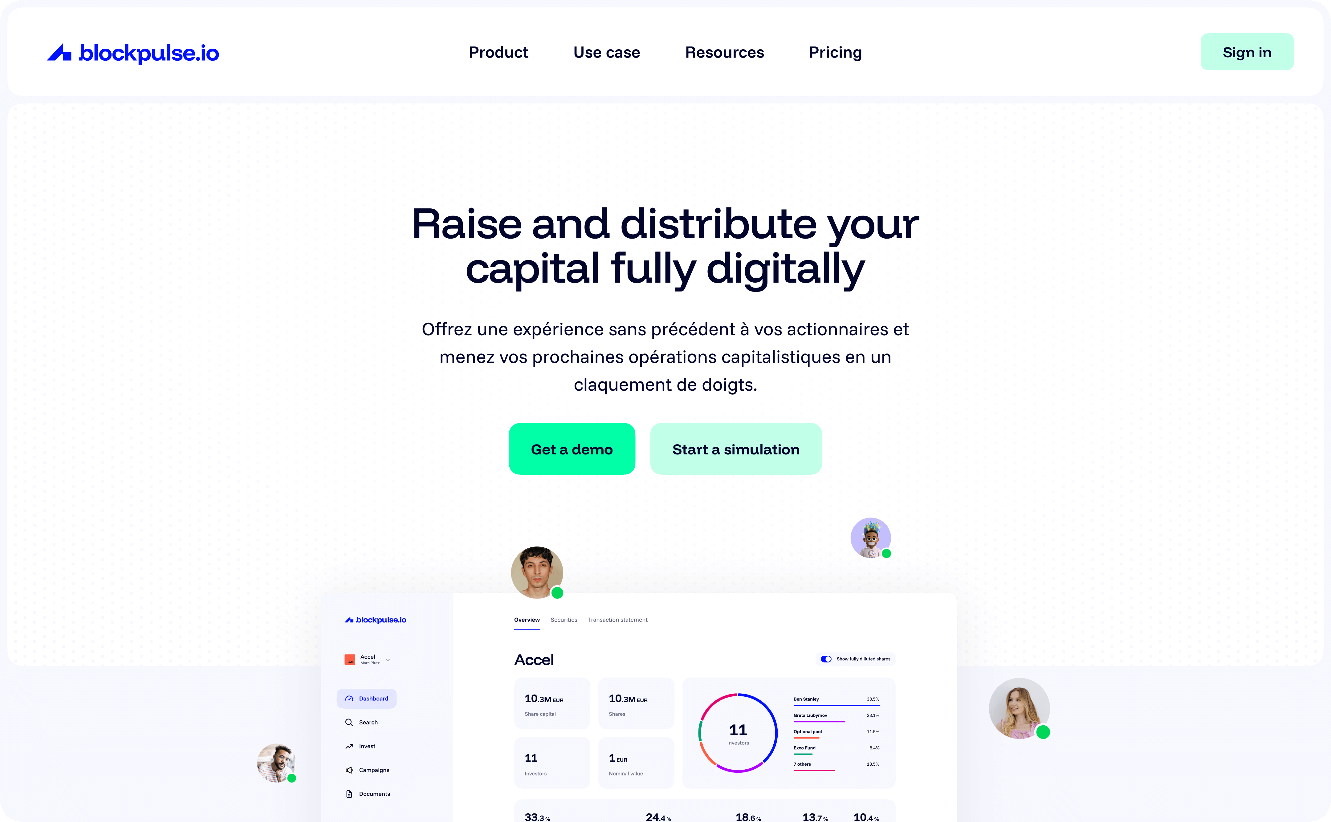
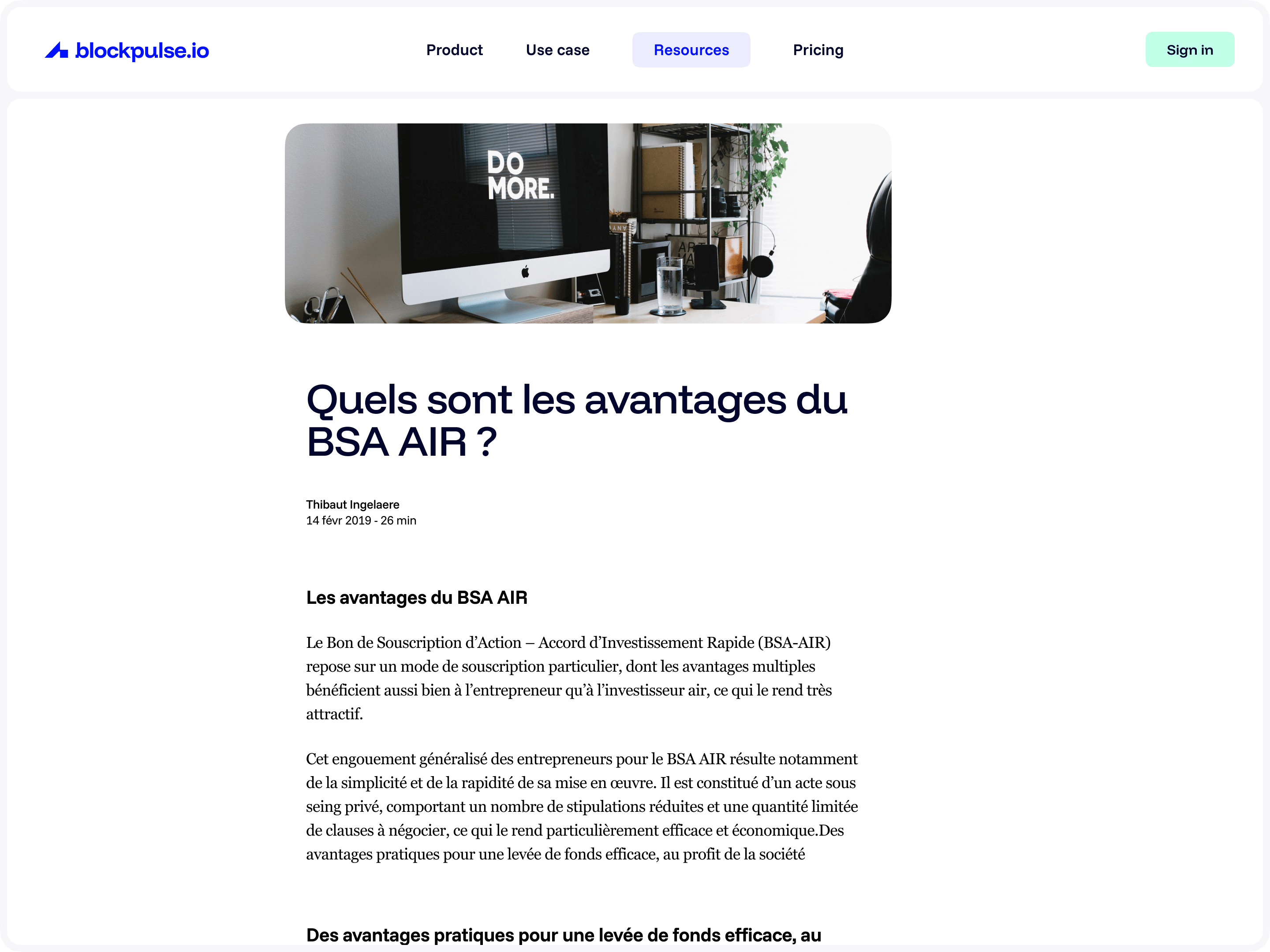
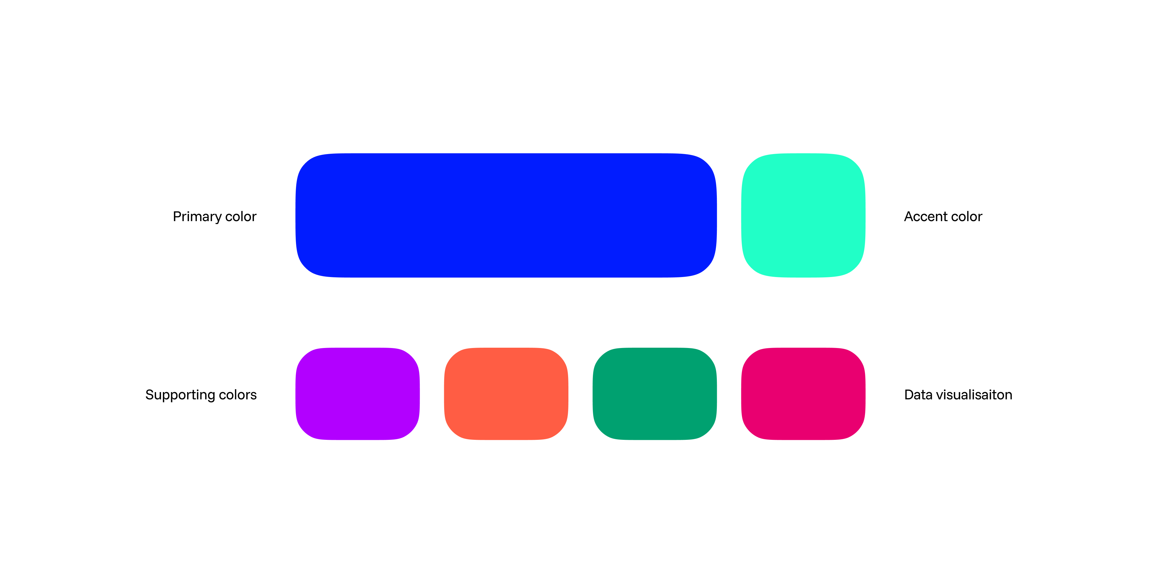
Marketing site & Branding showcase
Platform redesign
Here are a few examples of key areas of improvement:
Better overview on the landing page
- Key information is visible at a glance.
- Core, most common tasks were made more prominent.
- Better status overview of investors within cap table.
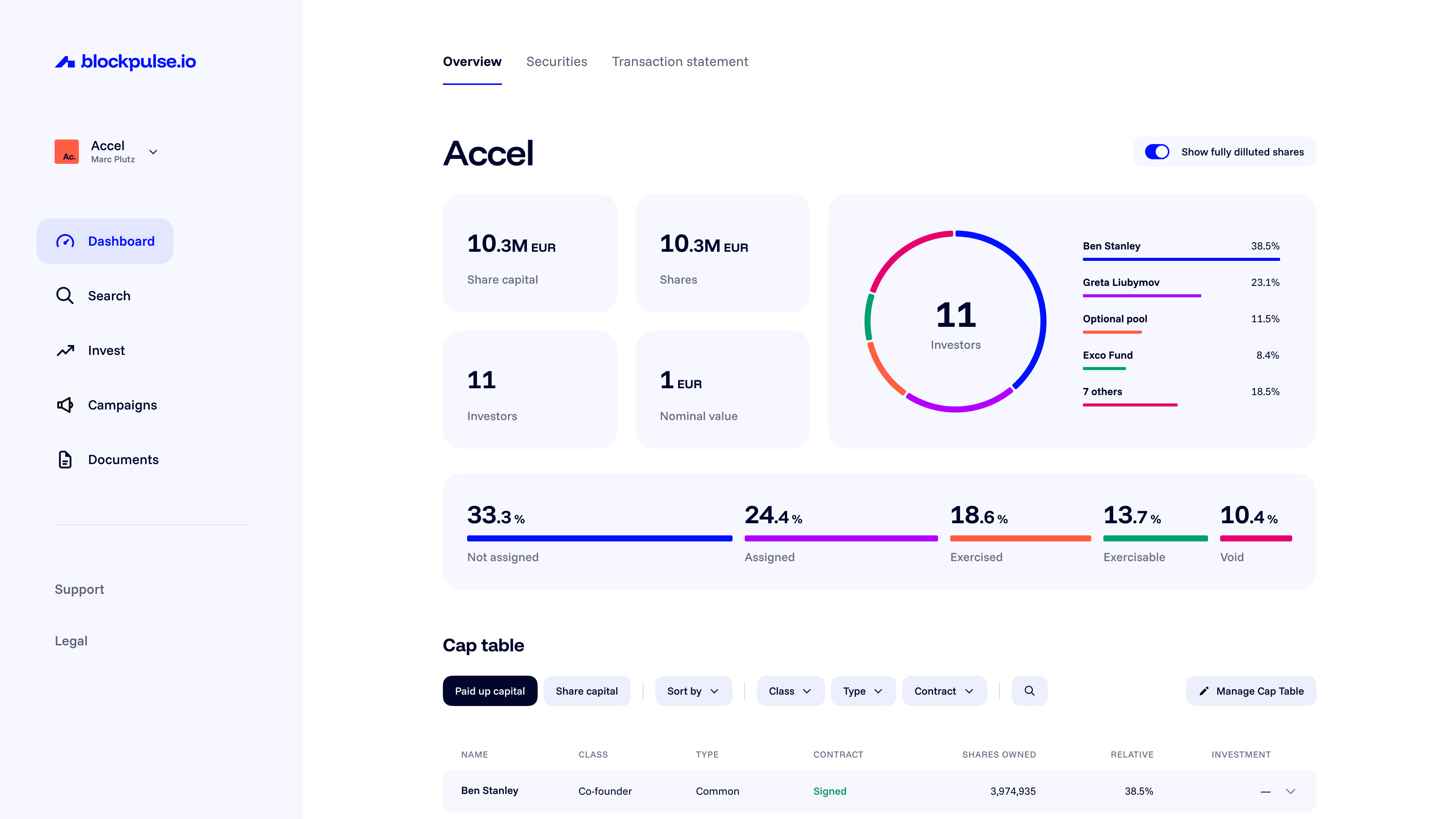
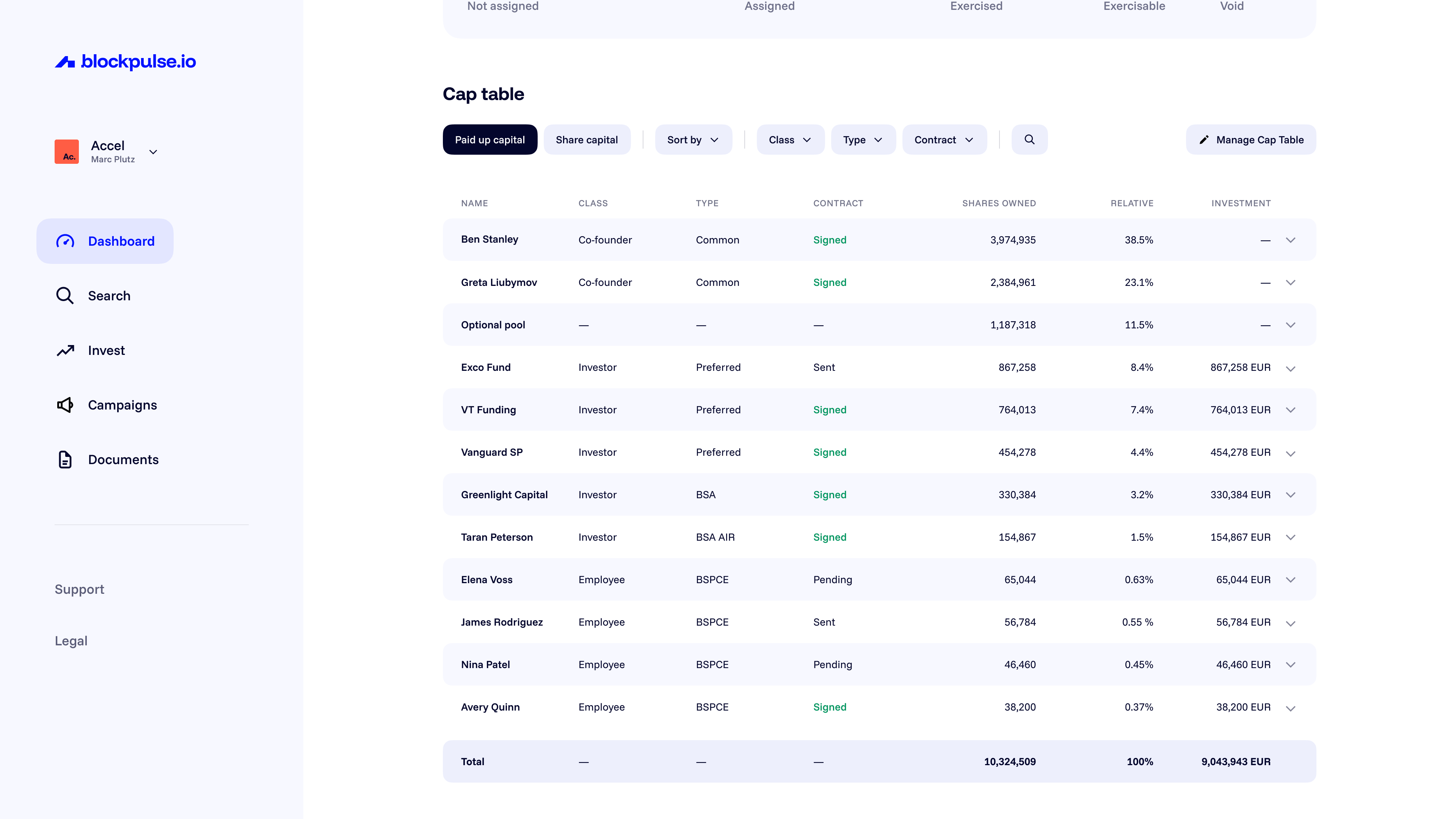
Dashboard
Campaign creation flow
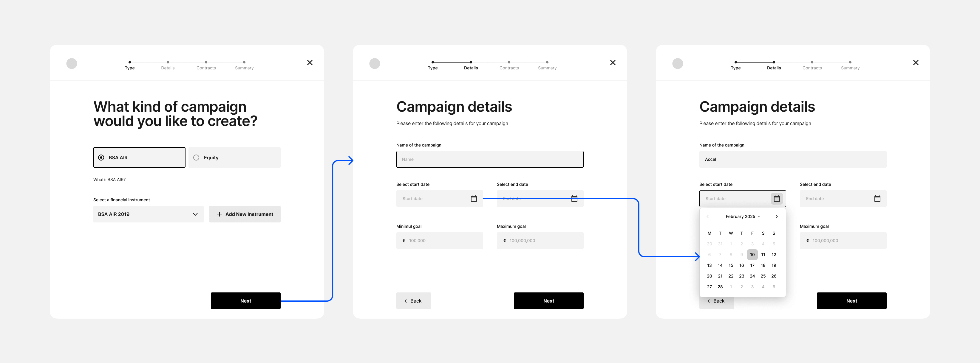
- Introduced a guided, wizard-style setup for campaigns.
- Contextual tips, progress indicators, and smart defaults.
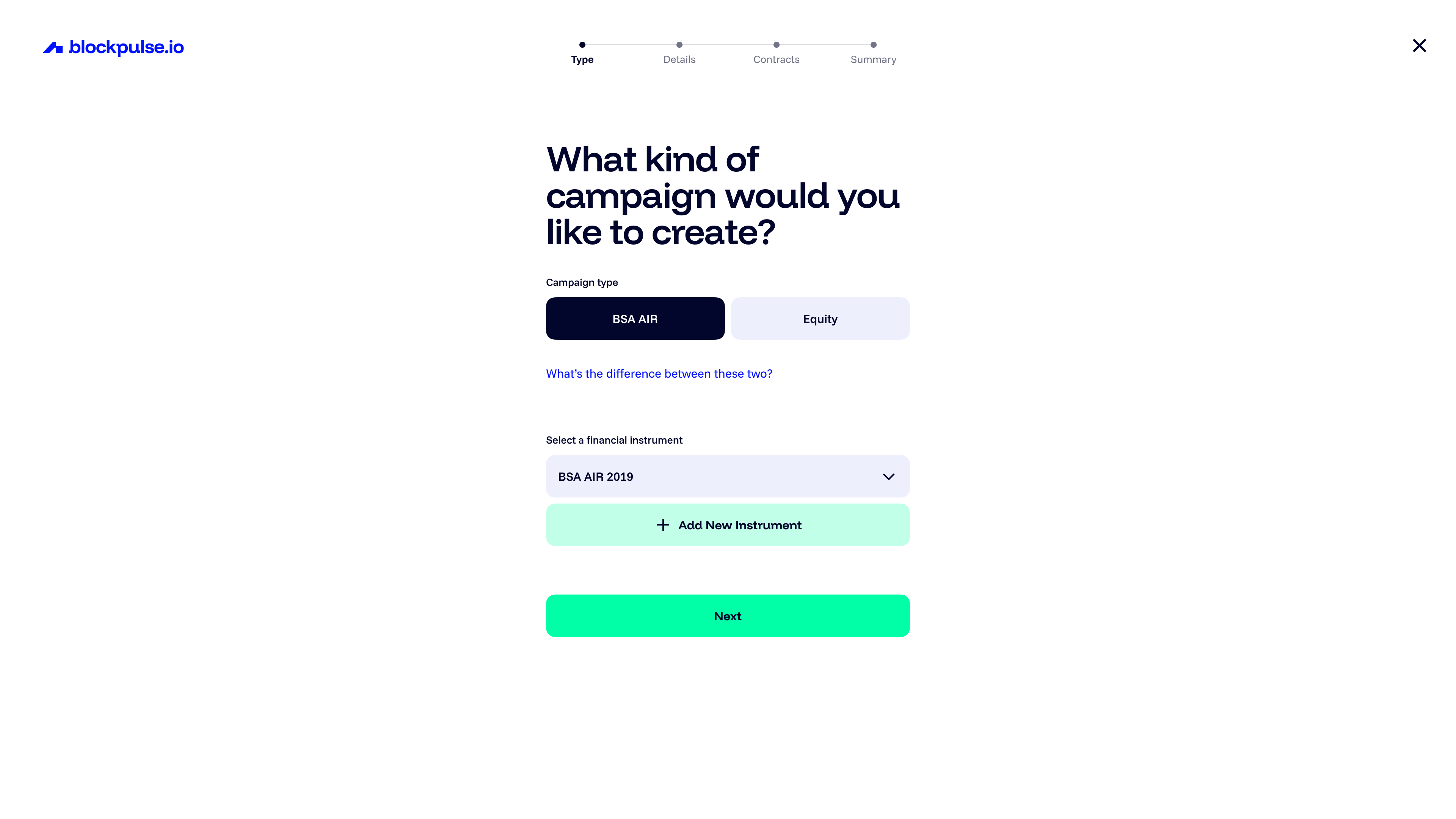
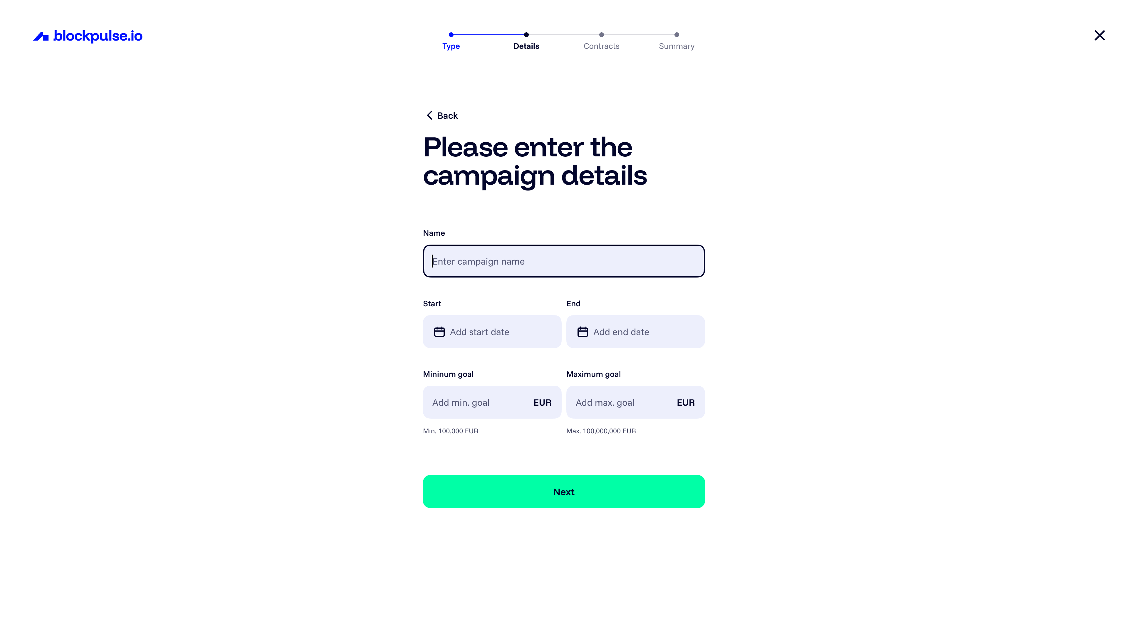
Campaign creation flow steps
Investor browsing & investment flow
- Added personalised recommendations, filters, and risk levels.
- Streamlined wallet setup and "Know Your Customer" (KYC) verification.
- Transparent milestone-based funding visuals.
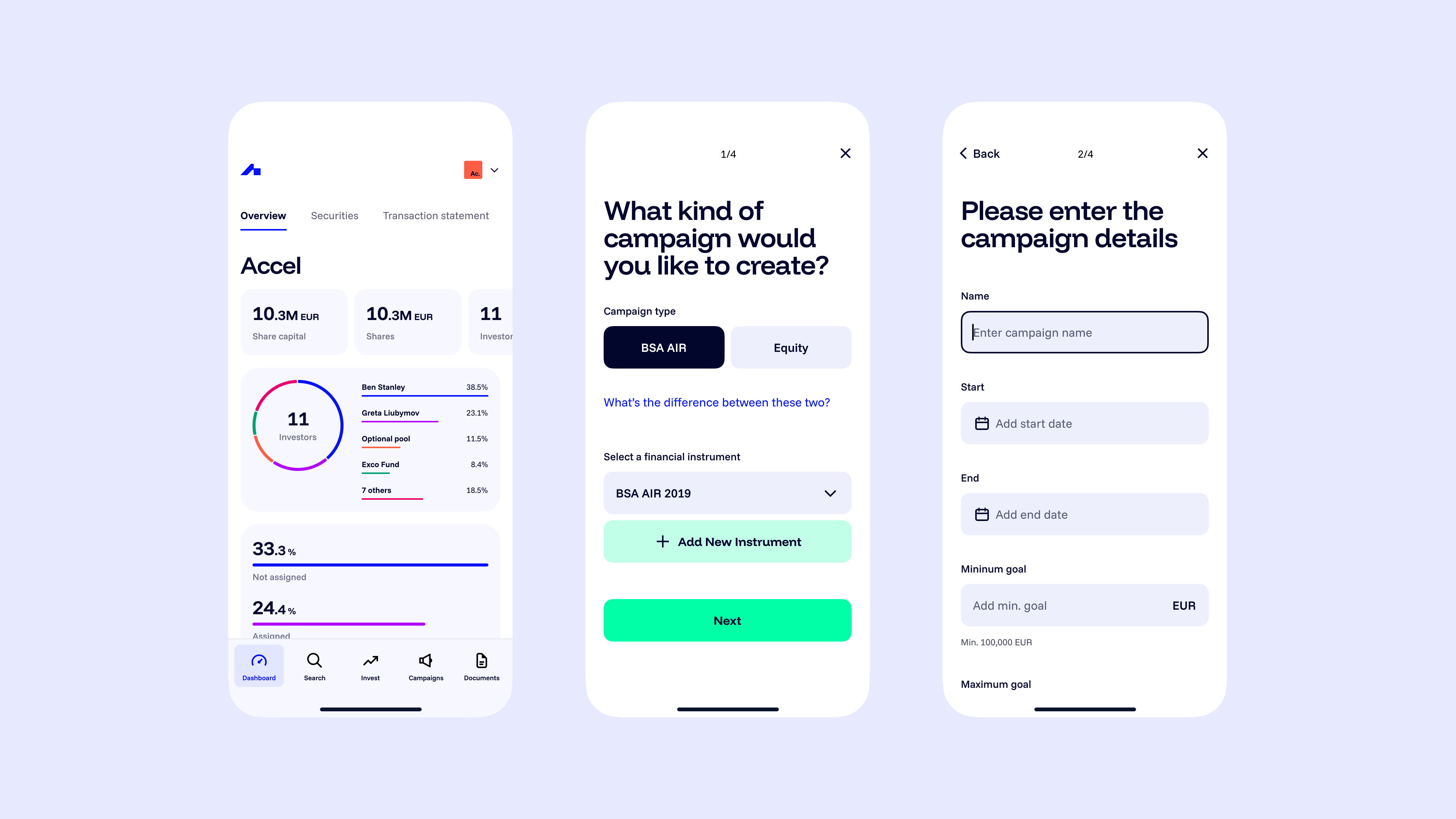
Responsive design
The largest portion of users were using the platform on desktop, which remained the priority. However, a non-negligeable part of the userbase used the product on their mobile phones. The PWA was optimised to be responsive and work on any display as a result.
Collaboration & Implementation
I collaborated closely with engineers to ensure pixel-perfect, functional results. Together, we built a strong Design System (components and patterns) to improve efficiency, scalability, and consistency.
We wanted to avoid waterfall-type handoffs, and while we did have regular UI QA ceremonies, we relied a lot more on day to day ad-hoc conversations and check-ins. This resulted in rich, multi-disciplinary discussions from which lots of ideas and improvements were born.
Lessons Learned
- Clear educational UI is essential when introducing blockchain tech to non-tech-savy users.
- Trust signals (like third-party audits, testimonials, secure wallet integrations) directly influence conversion.
- Onboarding flows tailored by user role benefited their completion rate immensely.